
From Interface to Infrastructure
What occurs when fitness experiences evolve from app-based interfaces to spatial systems that coordinate space, time, and bodies beyond the screen?

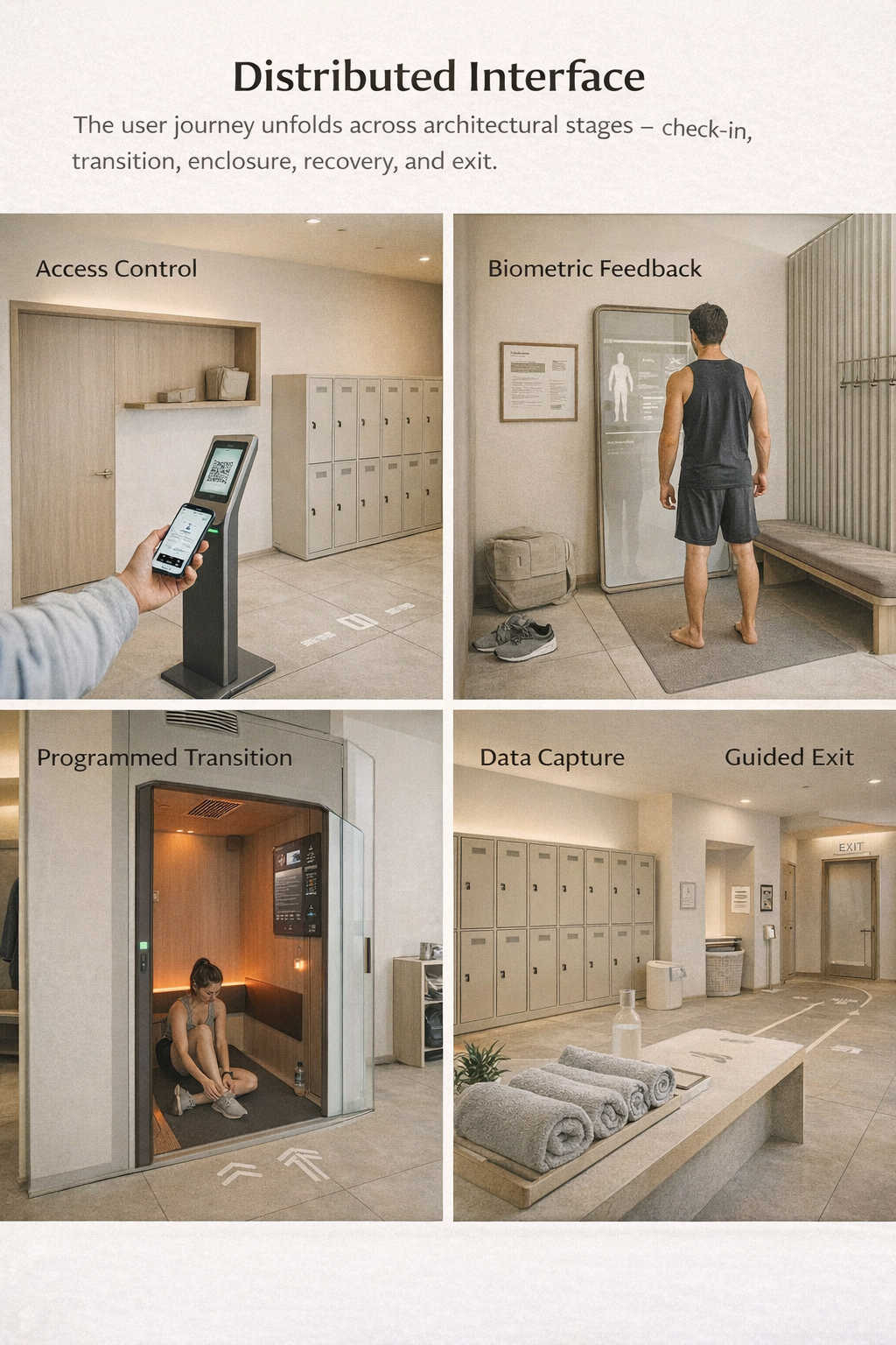
The fitness system is no longer guided by a screen, but by space itself. Entry points act as thresholds of control, circulation paths structure movement, enclosed pods regulate intensity, and the central lounge completes the behavioral loop. The architecture becomes the interface — shaping attention, timing, and compliance without requiring constant user input.
What occurs when fitness experiences evolve from app-based interfaces to spatial systems that coordinate space, time, and bodies beyond the screen?
Over the past decade, fitness apps haven’t just moved workouts onto our phones. They’ve changed how we relate to our own bodies. Instead of noticing when we’re tired, deciding when to rest, or building trust in our own judgment, we now look to streaks, timers, badges, and performance stats. Motivation comes from numbers and notifications, not from inner awareness.
At the same time, “third places” — the cafés, studios, and community spaces where people once gathered to connect and grow — have slowly shifted. Many now operate less as places for real belonging and more as carefully designed sales funnels, shaped by trends and marketing cycles rather than by the actual needs of the people inside them.
This case study looks at that shift through a fitness space where the app’s logic is built into the architecture itself. You make your choices before you walk in. Once you’re inside, the space takes over.
Instead of tapping a screen or scrolling through options, the design guides you — through doors and entry points, through scheduled timing, through the size and shape of the room, and through subtle signals in the environment that direct your behavior.
To understand this shift — from interface to infrastructure — is to see how control moves from the screen into the space itself. And once that happens, the real question becomes: what kind of independence, discipline, and freedom does this design actually create in the body?
When App UX Leaves the Screen
A spatial fitness system is a workout environment where the space itself directs your behavior. The building works like an interface.
Instead of relying only on an app or a trainer, the room guides what you do, when you do it, and how long you do it. Layout, lighting, sound, timing, and equipment placement work together to structure the experience. The walls, walkways, machines, and enclosed rooms take over the role once played by signs and screens. You don’t read instructions. You move through them.
As these systems evolve into smart spaces, the phone changes roles. It is no longer just a display. It becomes a key and a scheduler. It unlocks doors, reserves time, verifies identity, and syncs your data across locations.
You may see fewer screens, but the system itself becomes more powerful.
When design moves off the phone and into the building, the problem changes. It is no longer about buttons or layouts. It is about how space shapes behavior. How it sets limits. How it creates routine. How it reduces choice in order to increase compliance.
The program defines the rules: who enters, how long they stay, what sequence they follow. Your membership profile refines the experience. The system tracks your history and adjusts access, timing, and intensity over time.
Control does not disappear when the phone leaves your hand. It relocates. It becomes architectural.
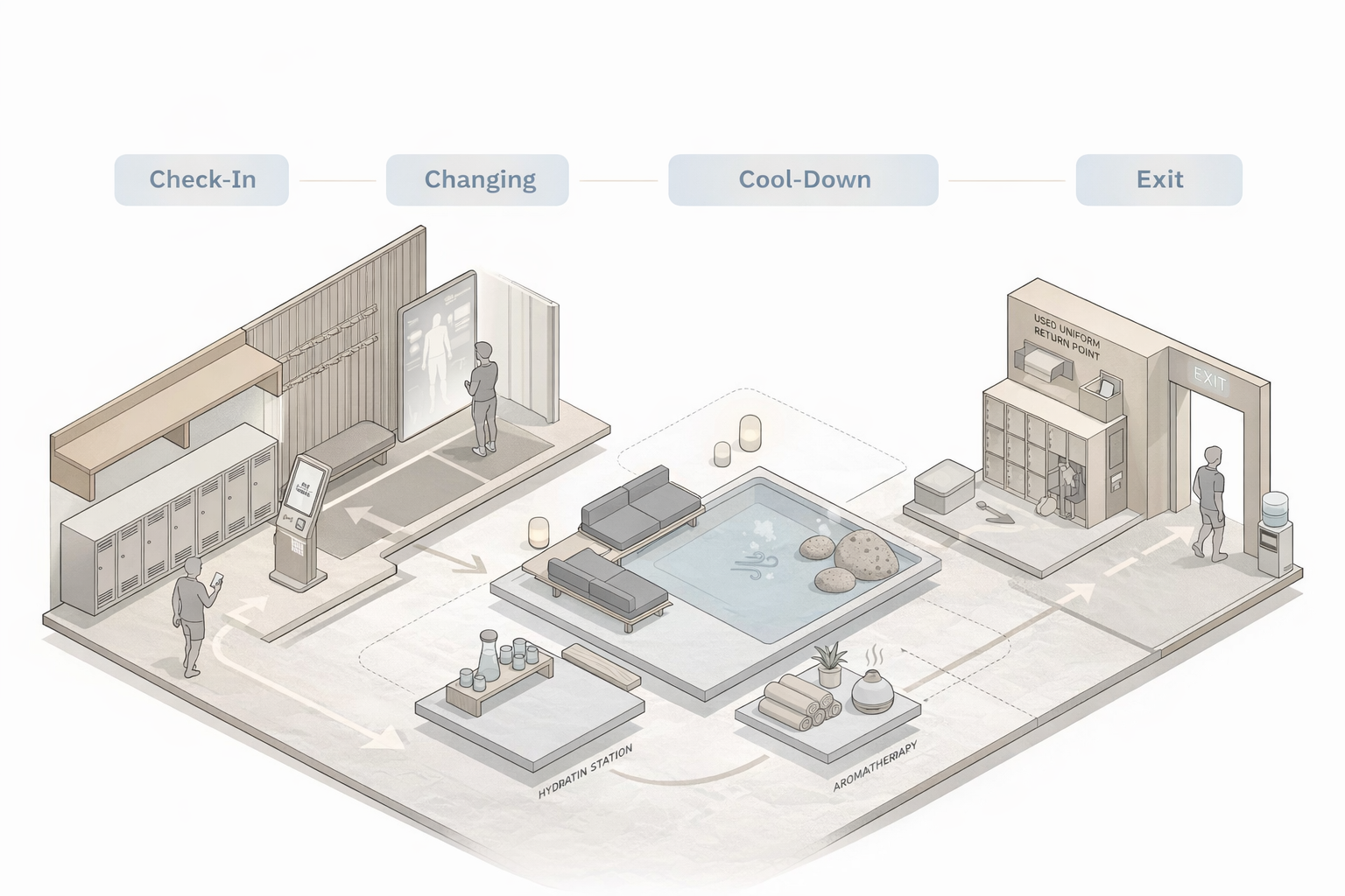
The user journey unfolds across architectural stages — check-in, transition, enclosure, recovery, and exit. Interface elements are no longer confined to a screen. They are embedded into walls, kiosks, mirrors, floor markings, and circulation paths. The system is spatial, sequenced, and continuous.
The Pod as Personal Trainer
As fitness apps move beyond the phone, their logic does not disappear. It becomes physical. Timers, cues, feedback, and behavioral nudges move off the screen and into the room. Architecture stops being a backdrop. It becomes the interface.
The pod makes this shift clear. It does not simply host activity. It sets the conditions for it. Heat, light, sound, enclosure, and orientation take over the role once played by buttons, alerts, and progress bars. What used to be adjustable in software is now built into walls and thresholds.
This is not just a room. It is a controlled environment for the body. It isolates attention, standardizes the experience, and delivers a preset sequence of states. The phone still exists, but only as a remote control. It verifies access, assigns sessions, and tracks time. The main interaction now happens through space.
Framed as “somatic,” the pod promises focus and support. But it also limits flexibility. You can silence a notification. You cannot easily silence heat or step outside a tightly enclosed room mid-session without breaking the flow. When UX becomes environmental, negotiation becomes harder.
The diagrams that follow examine the pod not as a wellness object, but as architecture shaped by app logic. It is designed for repeatability, containment, and control. The key question is not whether spatial technology is good or bad, but what kinds of habits, behaviors, and forms of independence it creates in the body.
The Pod as Personal Trainer:
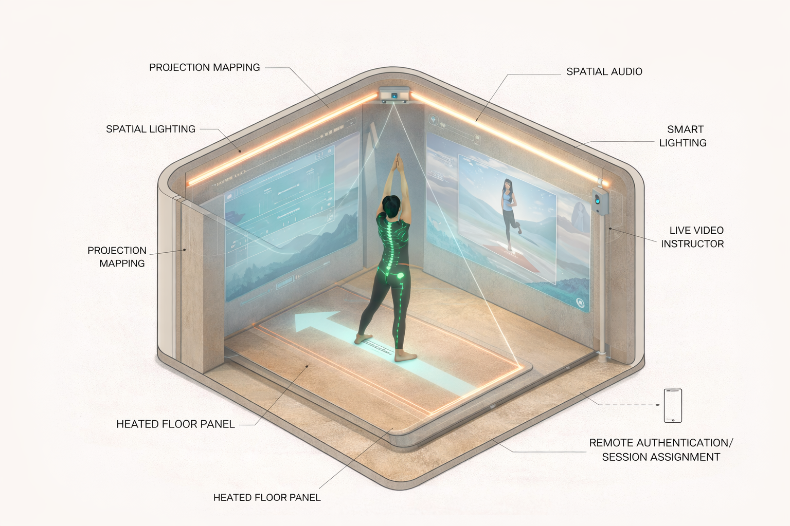
Projection-mapped alignment cues, spatial audio, biometric sensing, and live instructor feeds transform the room into an active coaching system. Guidance is delivered through light, sound, heat, and data, making the environment itself the primary interface for correction, timing, and control.
The UX Stack
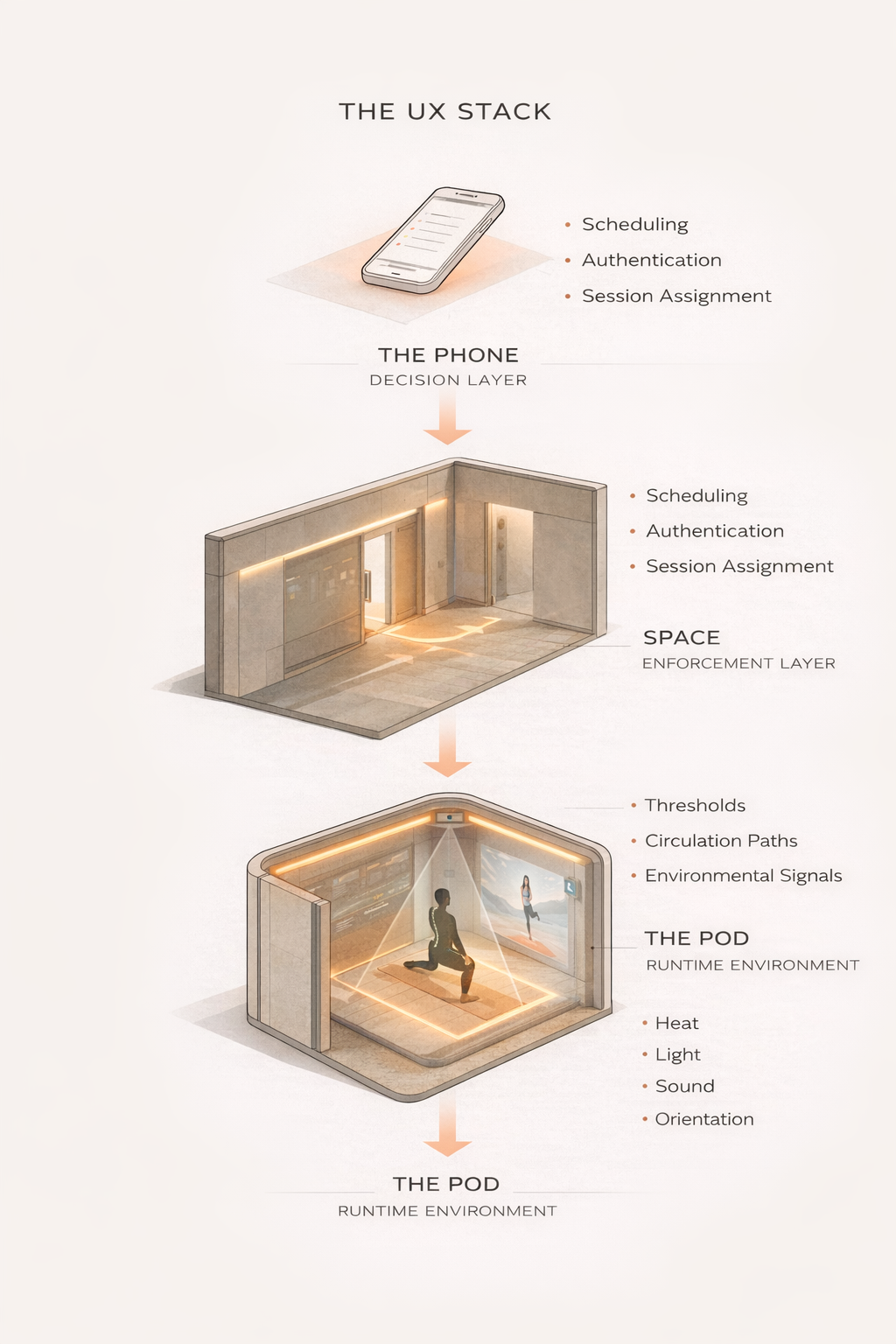
This system works as a layered stack. Control is divided across device, building, and enclosure. Each layer holds a different kind of authority.
1. The Phone — Decision Layer
Commitment happens here. You choose a time, confirm access, and agree to the conditions in advance. The phone stores your identity, history, and preferences. But once the session begins, it steps back. It coordinates entry. It does not manage execution.
2. The Space — Enforcement Layer
The building takes over. Doors unlock at specific times. Circulation paths guide movement. Lighting and sound signal transitions. The session has a beginning and an end built into the environment. These cues cannot be adjusted moment to moment. They structure behavior through thresholds, timing, and enclosure.
3. The Pod — Runtime Environment
Inside the pod, the logic becomes physical. Heat, light, sound, and spatial orientation deliver the session directly to the body. There are no visible menus and no ongoing negotiation. The experience runs according to preset parameters unless you leave the system entirely.
Together, these layers describe a shift. UX no longer lives primarily on a screen. It becomes distributed. Decisions are made upfront. Execution happens in space. Control moves from interaction to infrastructure.
The UX Stack:
Decision is handled by the device. Enforcement is embedded in the building. Execution occurs inside the pod. Together, these layers distribute authority across device, space, and enclosure.
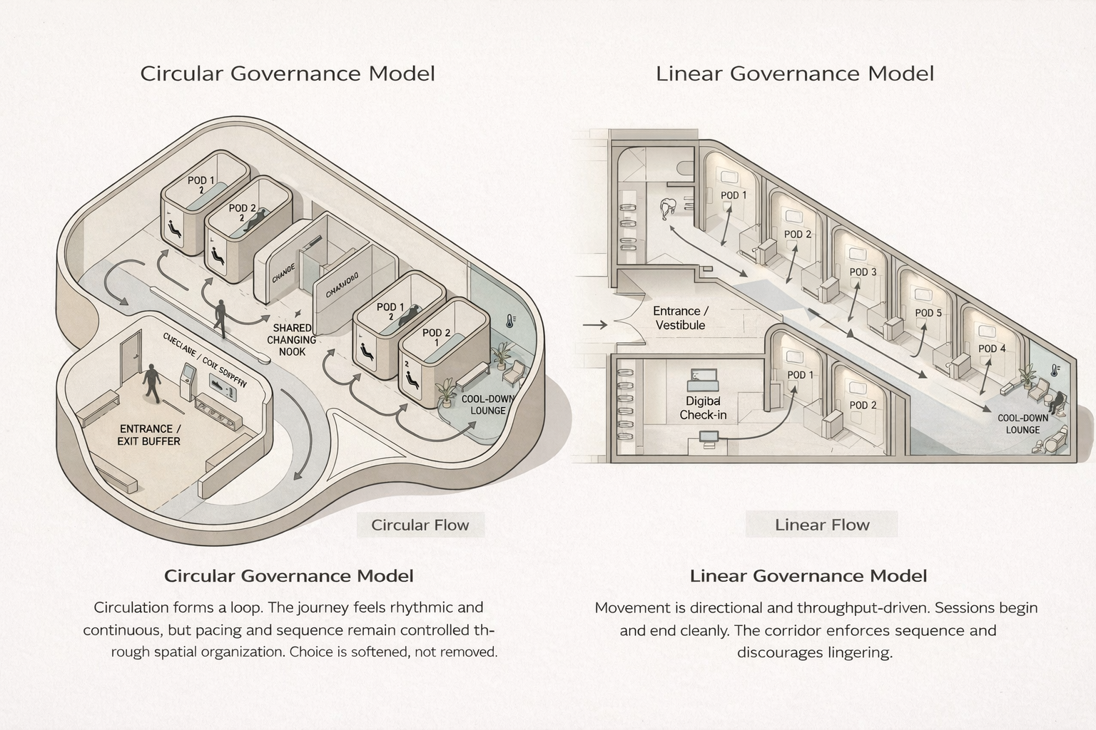
Reading the System in Space
These diagrams do not describe a place. They describe a system.
The user journey is procedural: entry, preparation, execution, recovery, exit. There are no branches. The body moves through a fixed sequence, like a task moving through an application flow. Architecture replaces screens, but the logic remains linear.
The layout comparisons reveal different styles of control. A linear plan prioritizes throughput and clean transitions. A circular plan softens the flow but still regulates pacing and duration. The difference is not freedom versus control, but how visibly control operates.
The pod is where the system resolves. Heat, light, sound, and enclosure execute the session directly on the body. There are no menus to adjust and no interface to renegotiate. Once inside, the experience runs as configured.
UX is no longer something the user interacts with. It is something the user moves through.
Why This Matters
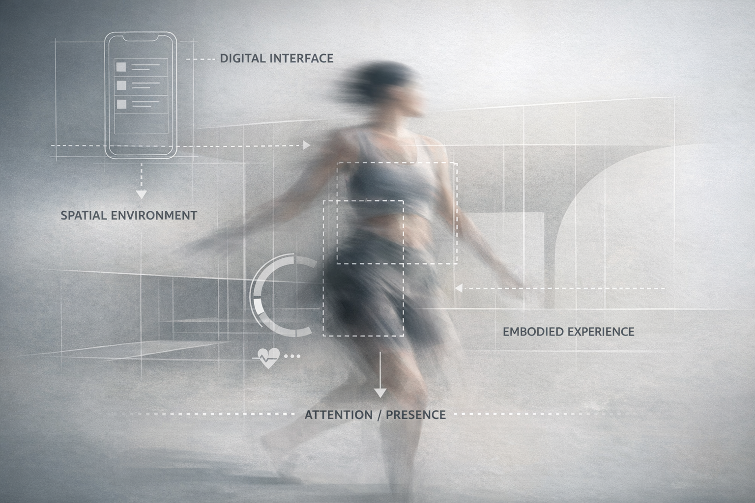
When UX becomes spatial, agency changes. A screen can be ignored, paused, or closed. Architecture cannot. Once app logic is embedded into space, control operates through timing, enclosure, and movement rather than moment-to-moment choice.
This makes spatial technology inherently powerful. The environment no longer contains linear user journeys; it adapts and facilitates based on user behavior. As UX continues to migrate from interface to infrastructure, designers move beyond shaping interactions. They begin shaping the conditions under which autonomy is exercised. The question is not whether these systems function effectively. It is what kinds of habits, disciplines, and selves they quietly produce.
If the future of UX is architectural, then the future of agency is spatial.
Designing Commitment: How Fitness App UX Shapes Practice
Fitness apps don’t just organize workouts — they design how people experience time, space, and themselves. A Spatial UX comparison of Equinox, Hotworx, and ClassPass reveals how digital systems can either support presence and continuity or quietly fragment attention across physical and digital environments.
Most fitness brands misuse the term 'lifestyle.'
They mistake it for an aesthetic—luxury, aspiration, performance polish. Looping videos of slow-motion sweat. Peppy models in spandex talking at you about “the burn”, with little acknowledgement that a 45-year-old nervous system needs a different entry point than a 22-year-old’s beach-body fantasy.
Lifestyle doesn’t come from trends. It emerges at the intersection of mindfulness and spatial systems.
In this article, the spatial system is used to describe a third space integrated with digital interactions that actively shape access, experience, and relationships over time. Sociologically, the third space is neither home (first) nor work (second). It is the local gym, the dojo, the studio where you are known by name—where repetition happens in shared time and shared presence. In fitness, third spaces don’t replace self-practice; they scaffold it. They function as shared infrastructure, concentrating equipment, services, and community in ways individual homes rarely can.
Modern UX, however, is quietly eroding this container.
By treating fitness like a beauty treatment—the ClassPass-ification of movement—we’ve traded expertise for convenience. We’ve prioritized the video-maker over the teacher, and self-tracking over self-awareness. Content-driven brands largely ignore how their media choices shape instruction—whether guidance is responsive or passive, live or pre-recorded, visual or audio—and whether attention stays in the body or drifts toward spectacle.
UX doesn’t just facilitate a workout. It structures behavior. Unlike standalone apps or at-home video platforms, spatial systems bind digital interactions to physical repetition. Booking systems, media formats, and data feedback loops are not optional features; they are behavioral architecture.
This case study examines how the spatial UX of ClassPass, Equinox, and Hotworx, and either anchor people in embodied practice—or fragment attention across a digital void.
The question is not whether we are moving, but whether we are building understanding of our bodies, or merely consuming a service.
-
The article "A systematic review of intention to use fitness apps (2020–2023)” analyzes the academic literature to understand what motivates people to download, use, and stick with fitness and physical activity applications.
Key Themes and Findings:
The "Pandemic Push": The study notes that the COVID-19 pandemic was a massive catalyst for the fitness app market, as lockdowns forced a shift from gyms to home-based, tech-driven workouts.
Evolving Psychological Models: For years, researchers used the Technology Acceptance Model (TAM)—which focuses on "perceived ease of use" and "usefulness"—to explain app adoption. This review found that researchers are now using more complex models that include factors like hedonic motivation (fun/pleasure), habit, and social influence.
Social & Comparison Factors: A major finding is the role of social media. Users are heavily influenced by the ability to share achievements and compare themselves to others, though the study notes that "fitness comparison" can be a double-edged sword for motivation.
Gamification and Self-Efficacy: Features like badges, leaderboards, and rewards (gamification) are highlighted as essential for user satisfaction. The study also emphasizes that apps are most effective when they increase a user's self-efficacy—their belief in their own ability to complete a workout.
Regional Trends: The review noted a significant increase in research coming out of Europe, indicating a growing academic and commercial interest in the digital fitness sector in that region.
Why it Matters:
The article concludes that fitness apps are no longer just "trackers" but have become complex social tools. For developers and health professionals, the research suggests that to keep users engaged long-term, apps must move beyond simple data logging and focus on dynamic communication, community building, and personalized motivation.
Read the full article here.
-
This article, published in the British Journal of Sports Medicine (BJSM), is one of the largest and longest of its kind, following over 516,000 users in Canada over a 24-month period.
The Core Findings:
Sustainability: The study found that fitness apps can sustain physical activity increases over two years, but the effect tends to peak early. After 12 months, the initial "boost" in activity often begins to wane.
The "1,000 Step" Threshold: While the average increase across all users was modest (roughly 250–464 steps per day), which is below the 1,000-step "clinical significance" threshold, the results were more positive when looking at individual outcomes:
40% of users saw a clinically significant increase of 1,000+ steps per day at the 12-month mark.
39% of users maintained that 1,000+ step increase even after 24 months.
Impact on "Low Active" Users: The most significant benefits were seen in people who were the least active at the start. For these users, the increase in daily steps was much higher, suggesting that apps are most effective for those who have the most room for improvement.
The Role of Incentives: The study evaluated the "Carrot Rewards" app, which used "micro-incentives" (small financial or loyalty point rewards). The researchers concluded that while these rewards help, they might be financially unsustainable for long-term public health programs, suggesting a need for AI-driven or "gamified" alternatives.
Why This Article is Important:
Massive Scale: Most fitness app studies are small (under 500 people) and short (3–6 months). This study’s use of half a million people over two years provides much more reliable "real-world" data.
The "Waning" Effect: It highlights a major challenge for the tech-fitness industry: Retention. It shows that simply having an app isn't enough; the intervention needs to evolve to keep users from getting bored or "dropping off" after the first year.
Public Health Potential: It proves that even if an app only causes a "small" increase in steps, at a population level (hundreds of thousands of people), that translates to a massive improvement in public health and a reduction in chronic disease risk.
Read the full article here.
ClassPass: Discovery Without Devotion
ClassPass is a subscription platform founded in 2013 that aggregates boutique fitness studios into a single, credit-based booking system. Its original value proposition was access: one membership, many studios, no long-term commitment. The model scaled rapidly in dense urban markets by monetizing unused class capacity and positioning fitness as something to sample rather than settle into.
That same structure undermines long-term practice. By design, continuity is discouraged. Users rarely remain with a single teacher or method long enough to adapt, progress, or develop embodied familiarity. The interface rewards circulation over depth, movement over mastery.
This reveals a broader issue in fitness UX: many platforms are business-centered before they are human-centered. Systems like ClassPass are optimized around studio economics and market demographics—filling unused capacity, accommodating 9–5 schedules, and retaining users through novelty—rather than around how humans actually build discipline, skill, and embodied continuity.
From a marketplace perspective, this logic is sound.
From a practice perspective, it fails.
Over time, ClassPass has evolved from a fitness booking tool into a broader lifestyle marketplace that includes spas, beauty services, recovery treatments, and self-care appointments. This expansion reframes movement practices like Pilates and yoga not as disciplines, but as interchangeable perks within a discretionary wellness economy. A Pilates class now sits alongside a facial or massage under the same credit logic, signaling episodic consumption rather than sustained study.
The UX reflects this shift. It optimizes for choice, convenience, and novelty, appealing primarily to users—often urban professional women—who experience fitness as a lifestyle enhancement rather than a formative practice.. The result is a system that performs well as a marketplace but poorly as an environment for depth, progression, or long-term commitment.
-
This UX/UI Case Study by Camille Kurasz, addresses a common problem in tech-enabled fitness: Choice Overload. When an app offers too much variety, the interface can become cluttered and confusing, leading to "user friction" that prevents people from actually working out.
Proposed Solutions:
Neutral Branding allows the studio's photos to be the focus, rather than the app's own heavy branding.
Streamlined Homepage: The redesign prioritizes the user's most frequent actions:
Showing recent classes first.
Quick access to frequently visited studios.
A simplified top navigation bar focusing only on Profile, Map, Calendar, and Credits.
Simplified Search: Instead of an overwhelming list, classes are grouped into clear, activity-based categories (e.g., "Strength," "Yoga," "Cycling").
This article shows how even if the technology (the booking engine) works, poor design can be a barrier to fitness. If the booking experience is stressful, users are less likely to stick with it.
Read the full article here.
-
It’s worth noting that ClassPass did provide access to otherwise exclusive spaces, including the Iyengar Yoga Institute of New York. Access was limited to Level 1–2 classes and skewed older in demographic, but the pedagogical value remained high. Even at an introductory level, Iyengar methodology—precision, sequencing, duration—offers real depth. The limitation was not quality, but continuity. The platform enabled entry while failing to support sustained study.
Equinox: Branded Consistency at Urban Scale
In New York City, Equinox works better than it has any right to—largely because of urban density. Founded in NYC, the brand maintains a high concentration of clubs clustered along subway lines. This produces a distinctly New York lifestyle effect that is not replicable elsewhere, even in markets like California with many locations but a car-dependent culture. New Yorkers walk. They stack errands. They need places to exist outside cramped apartments and increasingly privatized public space of Manhattan.
Within this context, Equinox’s destination membership functions as a decentralized third space. Distinct experience zones extend the visit beyond a workout: juice bars double as informal coworking areas; expansive gym floors support open-ended, self-directed training; sauna and steam rooms elevate the locker room into an executive lounge–spa hybrid, designed as much for recovery and decompression as hygiene. Layered on top are group classes and personal training with elite instructors, creating multiple modes of engagement within a single visit.
It is not just fitness. It is spatial infrastructure for daily life.
From a UX standpoint, Equinox succeeds because it enables teacher-based loyalty, not just class selection. Members can follow instructors across locations, allowing routines to form around human relationships rather than schedules. Variety exists without chaos. The app’s real value is not the calendar—it is instructor continuity at scale. Once members find teachers that work for their bodies, consistency becomes structurally possible.
Where the system strains is at scale. Instructor quality varies widely, and a single misaligned class can undermine trust. As clubs become more crowded, containment erodes. Personalization thins. What once felt intentional begins to feel interchangeable.
-
This interface UX case study by Tim Bridgham examines how the product supports class discovery, scheduling, instructor visibility, and member engagement within a premium fitness brand. The analysis focuses on navigation structure, visual hierarchy, booking flows, and how digital touchpoints extend the in-club experience.
The case study frames Equinox primarily as a content and class-management platform, emphasizing features such as instructor profiles, class filtering, reservations, and account management. Success is measured through clarity, ease of booking, and alignment with Equinox’s luxury brand identity.
Notably, the analysis treats physical space, instructor quality, and embodied outcomes as largely external to the app. The digital product is evaluated as a coordination and discovery layer rather than as part of a broader spatial system shaping practice, attention, or long-term learning.
Read the full article here.
Hotworx: Automation Without Presence
Hotworx is built on a genuinely novel premise: 24/7 access to a fully self-operating fitness space. The model appeals to users with irregular schedules, high autonomy, and low tolerance for social environments. It also appeals to operators. Minimal human labor, standardized pods, virtual instructors, and automated access form a clean, franchise-ready system.
Hotworx programs behavior through space. The pod dictates posture, duration, and pacing. Time is algorithmic. Instruction is embedded into the architecture. With over 700 locations, the brand has achieved something rare: a consistent, repeatable spatial experience deployed at national scale. This is fitness infrastructure, not a single studio concept.
The digital layer reinforces this logic. The Hotworx app tracks sessions, gamefies participation, and translates practice into completion data—rewarding adherence to the system’s timing rather than responsiveness to the body. Progress is measured by showing up on schedule and finishing the programmed interval, not by adaptation, refinement, or internal awareness.
Where the system fails is alignment with human practice. The UX prioritizes automation over intelligence. Rigid timers replace tempo. Fixed video start times replace adaptability. “Virtual instructors” dominate attention while offering limited clarity and zero personalization. The videos themselves fail at basic demonstration. Camera angles do not clearly show alignment, transitions, or range of motion. Looping ads for franchise recruitment and Hotworx products interrupt sessions and cheapen the experience.
Content is played on screens that are too small and awkwardly placed, and users cannot select or control individual workouts—the pod initiates a fixed video program on a preset schedule. If a user arrives late, the session proceeds without them—even when the pod is empty. The system advances regardless of the body present.
The result is high stimulation with low presence. The space enforces performance, not awareness. Hotworx succeeds as a business-centered system optimized for labor efficiency and replication. It fails as a human-centered system designed to support embodiment or nervous system regulation. Metrics simulate progress, and attention is directed toward output rather than internal sensation. Presence is social and performative, not somatic.
In the context of this thesis, Hotworx exposes a different failure mode than ClassPass. Where ClassPass fragments practice through choice and novelty, Hotworx over-determines it through automation. Both prioritize operational efficiency over how humans actually learn, adapt, and stay with a practice. Designing for availability or performance is not the same as designing for self-awareness.
-
This portfolio case study by Jessica DePina analyzes a redesign of the HOTWORX mobile app, focusing on booking flows, gamified tracking, wearable integration, and visual polish within a franchise-based, automated fitness system.Success is defined through usability, engagement, and system efficiency—optimizing how users schedule sessions, sync devices, and complete timed workouts.
The case study treats instruction as fixed and evaluates progress through completion data and social metrics, offering insight into how performance-tracking logic is reinforced at the product level rather than questioning pedagogical or embodied outcomes.
Read the full article here.
Booking UX Optimizes Availability, Not Discipline
Many studio-centered fitness apps treat booking as the product.
You open the app. You see what’s available. You choose from what exists.
Booking UX is designed to expand access to physical spaces—to market classes and fill spots. But in doing so, it fails to support practice. Instead of creating conditions for discipline, it reduces training to availability. The app becomes a scheduler, not a support system. You are no longer committing to a practice; you are selecting from a menu.
What appears as flexibility is often fragmentation. The defining forces of in-person training—shared timing, reduced choice, external structure—are flattened into list views and calendar slots (filters if you’re lucky/peleton). Embodied commitment is replaced by logistical convenience, and discipline quietly dissolves.
This distinction—between access and discipline—helps explain why different fitness platforms feel so different in the body. When booking UX replaces containment with choice, the surrounding system matters more than the interface itself.
Some brands compensate through space, density, and consistency. Others lean harder into automation or novelty, accelerating fragmentation.
With that frame in place, the differences between ClassPass, Equinox, and Hotworx, and become clear. Each uses booking, scheduling, and access to shape behavior—but they produce radically different outcomes in practice, presence, and long-term commitment.
-
Description text goes hereThis UX Case Study by Aditya Mankare, explores how specific design changes can help users build long-term exercise habits by solving common friction points in the Peloton app.
The Core Problem: The "Scheduling Gap"
While Peloton has great content, users struggle to remain consistent because the app's native scheduling tools were too rigid. The article explores UX solutions.
The Flaw: Peloton’s original schedule focused almost exclusively on live classes.
The Reality: Most users work out according to their own busy lifestyles and prefer on-demand classes, but they had no way to "queue" or calendar those classes ahead of time.
Key Takeaways:
Habit Formation: The article argues that fitness apps must move from being "streaming platforms" to "habit-forming tools."
Decision Fatigue: One of the biggest barriers to tech-enabled fitness is the sheer volume of content. UX that organizes and automates choice is more effective for long-term consistency.
System Integration: For a fitness app to succeed, it must live where the user lives—meaning it needs to sync with the other digital tools the user already uses (like their primary calendar)
Read the full article here.
Screens Undermine Practice (Especially at Home)
Video is useful for learning a movement once. It is counterproductive for sustained practice.
Screens externalize attention. They interrupt breath counting, shorten hold times, and fragment focus. This directly undermines fascia adaptation, isometrics, long holds, and nervous system regulation.
What supports practice is minimal and systematic: audio cues, breath counts, subtle timing signals, and instruction focused on mechanics rather than performance. No playlists. No motivational speeches. No instructor theatrics. Just enough structure to replace a teacher’s presence without stealing attention.
Some platforms have experimented with this constraint—such as Aaptiv and Nike Run Club’s audio-led classes—but these approaches remain exceptions rather than norms, especially
The problem with screens becomes clearer when contrasted with in-person practice. In a studio or gym, attention is shaped by architecture, timing, and collective rhythm. The room holds you in the pose. The teacher sets the tempo. Other bodies establish duration and expectation. You stay longer not because you are motivated, but because the environment removes the need to decide.
Presence is enforced by context.
Most fitness UX optimizes for demonstration. Proper practice requires technique. That distinction is still largely ignored.
-
This article by the fitness technology company ASENSEI, provides a historical overview of how workout videos have evolved alongside technology—moving from passive viewing to active, AI-driven coaching.
1. The Historical Context
The 1980s Revolution: Jane Fonda’s 1982 video wasn't just about exercise; it was a political fundraiser that accidentally created a global industry. Crucially, it encouraged women to move their bodies, by providing an alternative to male-dominated gyms.
The "Whacky" Era: The rise of specialized and sometimes viral videos like Buns of Steel and Prancercise, proved that fitness could be marketed as entertainment.
2. The Social Media Shift
Accessibility vs. Toxicity: The article notes how platforms like Instagram and YouTube (Joe Wicks, Chloe Ting, Adriene Mishler) made fitness free and accessible, especially during COVID-19.
The Downside: It warns that social media fitness can lead to "orthorexia" and the promotion of unrealistic, edited body standards.
3. The "Revolution": Connected Fitness & AI
Closing the Loop: Traditional videos are "guided" (you watch them), but they aren't "coached" (they don't watch you).
Form Tracking: The article explains how new technology uses real-time motion tracking to correct your posture—such as telling you if you are leaning too far forward during a squat.
Personalization: Instead of a one-size-fits-all video, the technology adapts to your specific range of motion and skill level.
Read the full article here.
-
As we are all on our computers and phones more than ever before, let the yoga practice be a break from that, and an exercise in listening.
Audio only led yoga classes called Simply Listen aim to find the balance between instruction and self-practice, where people can listen to their own bodies guidance without awkwardly looking at a screen.
More audio-only guided yoga on YouTube.
Instruction Is Not Study (and Most Apps Confuse the Two)
Most fitness apps fall into one of two camps.
The first prioritizes content delivery for home practice: follow-along videos, fitness tracking, and social metrics designed to support motivation, consistency, and convenience—often at the expense of depth.
The second assumes in-person instruction: studios and gyms where learning happens through teachers, shared space, and access to equipment.
What’s largely missing is meaningful support for self-study—the slow, unglamorous work of understanding the body, memorizing postures, and building internal reference points away from a screen.
Instruction teaches execution. Practice builds internal structure. Practices like yoga, Pilates, and strength training lend themselves to somatic learning because they require sustained attention to breath, fascia, alignment, and internal sensation—unlike performance-oriented activities such as running or HIIT, where progress is defined by external output.
Performance-tracking systems are biased by design. They assume linear progress and visible improvement, reinforcing intensity over adaptation and metrics over perception. Tracking apps optimize for performance systems, not somatic systems—and performance systems are poorly suited to lifelong learning in the body.
One of the few systems that attempted to separate instruction (how to do a pose) from self-study (how to understand and inhabit it) was Floga, a digital yoga product that began as physical flashcards and later expanded into an app. Rather than offering follow-along classes, Floga treated yoga as a system to be learned—organizing postures by anatomy, energetics, and health effects instead of choreography or vibe.
That distinction mattered. Its information architecture allowed practitioners to filter poses by category, study individual postures in isolation, and assemble sequences intentionally rather than consuming prepackaged flows. The digital flashcards enforced the slow, unglamorous work of memorizing postures, understanding mechanics, and building internal reference points away from a screen. This is how people actually learn complex physical systems. This is pedagogy.
Very few fitness platforms meaningfully support this kind of self-study— Instruction teaches execution. Practice builds internal structure. When digital systems fail to distinguish between the two, learning collapses into performance.
What Practice-Centered Fitness UX Would Actually Do
A system designed for real commitment would be almost invisible.
It would prioritize audio-first guidance, breath-count timers, and long-hold support. Visual input would be minimal. Transitions would be silent. Timing would be precise without being punitive. Once practice begins, the interface would disappear.
No feeds. No leaderboards. No motivational noise. Only scaffolding that supports staying.
This logic is the foundation of Spatial Somatics. The framework begins with the user journey, not the content library, and prioritizes embodied awareness over external instruction. It assumes practitioners need protected environments—pods or rooms—where they can train on their own time, guided by instructors or methods that align with their bodies, goals, and constraints.
Technology plays a secondary role. It assists attention, regulates tempo, and adapts gradually over time rather than directing behavior. As the practitioner evolves, the system evolves with them. Membership value increases through depth, not novelty. Discipline is not extracted from the user; it is designed into the space.
A true lifestyle brand does not sell excitement. It builds structures that make consistency livable over time. Most fitness platforms design for attention. Practice-centered systems design for endurance—reducing decision-making, protecting focus, and supporting duration, especially in solo practice.
Discipline is not demanded from the user. It is encoded into the system.
That is the UX problem worth solving.
Spatial UX Design Strategy:
So what goes into creating a truly immersive wellness experience? This interactive blueprint reveals the invisible choreography behind Spatial Yoga—where somatic practices meet spatial computing and multi-sensory design.
Navigate the complete Spatial Yoga experience architecture. This blueprint maps customer touchpoints, technology integrations, and service delivery across six journey phases—combining infrared sauna therapy, immersive projection, motion tracking, and AI-guided instruction.
Interactive features: Scroll horizontally through journey phases • Click technology tags for detailed specs • Edit content in real-time